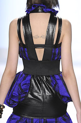
It's a fantastic coat. Beautifully tailored with great proportions. The problem is that plaid is simply too dated. It's not an updated take on an '80s plaid; it IS an '80s plaid. On the other hand, we like that the lines are so clean and uncluttered. He makes some great jackets and coats, but he definitely over-embellishes sometimes.
Ditto, only we're not sure if a more modern plaid would have helped those pants. It's striking, but it's terribly unflattering. LOVE that jacket though. The top is cute with a little edginess to it.
SHUT. UP.
This collection wasn't without its weak points but when Seth hits his strong points, he just knocks it the hell out of the park. This is a beautiful look. Again with the clean lines. The combination of the tweed and the stripes and the polka dots all work because the proportions and the use of each are so perfect. Harmony out of disharmony. We tend to agree with the judges that the big shiny flourish was perhaps a bit much and not needed. Still, his restraint throughout the collection was a great thing to show the judges.

SHUT. UP. AGAIN. Talk about hanger appeal. This is practically irresistible. Who wouldn't want to try this on? Gorgeous. The collar, the shoulders, the belt, all flawless. It really is a perfect look and showed once again a welcome amount of restraint on his part. The weave was enough. He knew he didn't have to Seth Aaron it up with a lot of gewgaws.

Speaking of which...
What can we say? We support the idea of putting some crazy attention-getting fantasy looks out there because, well, that's just the way Seth Aaron is, but there's pretty much nothing to compliment here. The proportions and the silhouette are just insane. She looks like a bug. It's like all that restraint he showed on other outfits came out in a big creative fart that he couldn't hold in any longer.
As we said, the collection was not without its problems but it demonstrated a couple things: an insane sense of drama and creativity, and something probably no one expected to see from the the man-boy designer: growth. In fact, that latter quality was something of a vindication for Tim Gunn, who took the drastic step of essentially telling him to trash his existing collection and start all over again on the grounds that what he was creating showed no growth. That very sense of the unexpected and the increased level of sophistication is what wowed the judges the most.
Tim isn't infallible, but he had a pretty rough season with this crew and we're happy to see him get a little neener-neener out of it. He's earned it. At the end of the day, all those designers who fought with him and said he wasn't worth listening to? Didn't win it. The designer who did EXACTLY what Tim told him to do, even though it was the most drastic step possible? Winner. Have a drink, sir.
Finally, there's something that a lot of people asked us to address and we can tell we're not going to get out of it: Seth Aaron's stated inspiration of German and Russian military from the 1940s, which, yes, technically would mean Nazis, at least in part. Here's the thing about that: we doubt very much that Seth was thinking along strictly historical lines; he was merely referring to a hazy idea of a certain aesthetic. Inspiration doesn't mean endorsement. One cannot reasonably point to any piece in this collection as an overt interpretation of a Nazi uniform. Instead, you'll find the same elements designers always turn to when doing a military-inspired collection; things like epaulet-inspired shoulder focus, severely tailored, belted coats, chevrons. In addition, the styling and some of the silhouettes were very '40s inspired. He was going for a look and a feel like any thoughtful designer would. There's simply nothing here to tie to Nazism. Besides, it all looks more Soviet to us. Even then, that doesn't mean he's showing his support to the politics of Stalin anymore than he is to Hitler.
There is creativity and all its inspirations and iterations, and then there is politics. The two should stay as far apart as possible. Trying to read too much into someone's creative process is a fool's game. That's what we think about that.
[Photo Credit: firstVIEW.com/David Russell/myLifetime.com - Video Credit: myLifetime.com]
Post a Comment
Labels: Project Runway, Project Runway Season 7, Project Runway Season 7 Episode 14, Project Runway Season 7 Finale, Seth Aaron Henderson


