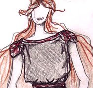
This is probably our favorite part of Project Runway blogging, when we look at the entire output of the finalists during the competition in order to tease out themes, strengths, and weaknesses. First up, the Granola Girl herself, Gretchen Jones. Take it away, Gretchen:

Two things jump out at us immediately. When someone reaches the end of the competition, they're the beneficiary of conventional wisdom, whether it comes from the judges or the viewers. In fact, the genesis of the "ology" posts came about because we wanted to address the incorrect assumption that Laura Bennett sent nothing but beaded cocktail dresses with plunging necklines down the runway. The word "granola" was tossed around quite a bit in the last episode in reference to Gretchen's aesthetic and looking over it now, we don't really see it. But let's put that aside for a second and talk about the other thing that jumped out at us.
We forgot how good her first three pieces were. The judges were right to rave about them (especially in light of the rather weak field of competitors); they're stylish, trendy, and have an urban, modern feel to them. And for some reason, right after she got all that initial praise, she seems to have fallen apart, design-wise. Actually, that's not quite true. Starting with her 4th look and continuing right through the second row of looks, THAT'S who Gretchen is as a designer. We consider her first 3 looks outliers. Maybe she was trying to give the judges what she thought they wanted. It worked, and for the rest of the competition she remained over-praised for every piece she sent down that runway.
No, that middle row perfectly encapsulates her POV, which Michael Kors once described as "Lady of the Canyons," which is far more descriptive and accurate than merely stamping "hippie" or "granola" on her work. She has a "West of the Rockies" vibe to her work, with a little Portland, a little San Francisco, some Colorado and even a little of New Mexico thrown in. It's not "high fashion" in the NY/LA axis sense of the word, but it's a strong aesthetic that a lot of consumers would go for.
As for themes, trends or motifs, clearly, she likes the neutrals best when it comes to colors, especially natural tones with lots of brown elements. She likes separates and she likes them to have a bit of flow and drape to them. She doesn't really do fitted and tailored looks. She'll occasionally dabble in a print, but it's not her first impulse, and her designs remains fairly consistently free of embellishments. She doesn't go for trims or sequins or beading. She makes real world clothes but she makes them for a very specific person: herself. There's nothing wrong with that. Plenty of designers, from Coco to DVF; Ralph Lauren to Calvin Klein, made a lot of money and got a lot of acclaim by convincing the world that it wanted to dress just like them.
In the end, given what we saw during the competition, we were very disappointed to see what she presented the judges this week. Gone was the flowy sophistication in favor of some sad, lumpy-looking garments that, to us, don't represent her that well. Even at her best, it's unlikely she'd get the win simply because from the perspective of Nina and Michael in particular, she's a niche designer. There's definitely a clientele for her, but it's not going to propel her into the ranks of "next great fashion designer."
[Collage Credit: projectrungay.blogspot.com - Video Credit: myLifetime.com - Photo Credit: Barbara Nitke/myLifetime.com]
Post a Comment
Labels: Gretchen Jones, Ology, Project Runway, Project Runway Season 8


