 This was one of those challenges that sound like fun when you first hear it and then you realize how frustratingly vague the parameters are. Create a piece inspired by the experiences that made you an artist using only materials from the children's museum. Most of the artists took that to mean "create child-like art" but Simon and the judges seemed to have a different perspective on it. Basically, it's one of those challenges that looks good on camera and pushes the contestants into emotional responses.
We're such jaded reality TV bitches.
 Good judge; concise and heartfelt critiques. He basically gave Peregrine the highest praise any artist can give another: I wish I'd done that.
 But come on, once they showed his work it became practically inevitable that Peregrine would win.
 So congrats to her! This was a really strong piece and it while it wouldn't have been our choice, it came in a very close second.

 The thing is, it's so evocative and so strong in its point of view, that you immediately get it - or you think you do. Based on what the judges were saying before she explained it to them, they seem to have come to the exact opposite reading than the one she intended. They thought there was a sadness being portrayed; a loss of innocence represented by the drugs and cigarettes. The thing is, Peregrine apparently had a VERY unconventional upbringing and she was remembering the drug addicts and partiers from her childhood with affection.
Not that it ultimately matters. The receiver has a right to interpret a piece however they wish and it's not necessarily wrong or a failure on the part of the artist if they come away with a very different reading. What annoyed us was that the judges quickly changed course when she explained what her intent was and acted as if they knew it all along.
 This was our choice for the win.
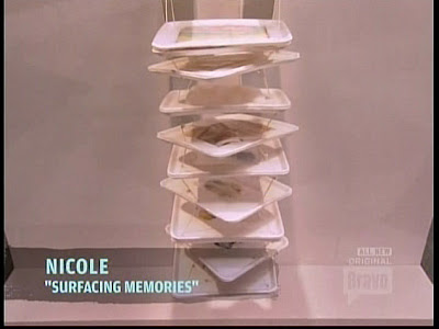
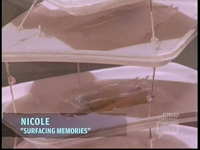
 A lot of Nicole's work draws the viewer in, literally, to get a closer look and that's a quality that we really respond to. She creates these quiet, thoughtful, and yet deeply emotional pieces. Not always, mind you, but when she gets it right, she gets it right. If we were to enter a gallery, we'd almost certainly gravitate toward a piece like this.
 Unlike Peregrine's, this is what she says it is: surfacing memories. That's not a knock on Peregrine's work (and many would say it's not exactly a compliment of Nicole's), but there's something stark and spare about the quality of her work that we really like.
Okay, let's look at the ones on the chopping block.

We agreed with the judges. It just didn't feel like there was anything of Abdi in this piece.


 It didn't help that it was seemingly composed of random symbols. We also agreed with the judges that if he'd paid more attention to the pieces that he felt were most representative of him (Superman, Spider-Man, Mighty Ducks) and used them as a launching pad, he might have had something. Putting in relatively meaningless stuff like the Nike symbol or tonally confusing stuff like the yin-yang symbol rendered the whole thing a little flat and a little confusing to the viewer.


 This one's a little tough to write about because Jaclyn inadvertently revealed things about herself that she either didn't intend to or didn't take the time to explore. We believe her when she says she was a lonely child. Her constant need for body validation and guidance in her art (What do you think? Should I do this? Should I not do this? I don't know what to do!) paints a picture (pun unintended) of a very insecure girl. The problem is, she isn't brave enough to really explore that in her art and instead we get these cold, emotionless, and relatively meaningless pieces.
Before we get to the eliminated artist, let's look at the middle pieces.


 Enh. It's kind of hard to judge from stills and video, to be honest. It's definitely something that needs to be experienced first hand. Put bluntly: from what little we saw, it didn't really do much for us.
 "The key to staying in the competition is making the challenge work for your art and not the other way around."
We take his point, really we do, but the fact of the matter is, he just did a low-rent version of something he's already done before:
 And did far better the first time.
 But we do love how he inadvertently exposes the bull-shittery of art critiques. "It makes me think of Space Invaders!" The fact is, this had nothing to do either with his childhood or with his development as an artist, but the judges struggled mightily to fit it in somehow.
 To their credit, they at least didn't fall all over it praising it.
And now, the eliminee (new word):
 It was obvious Ryan was getting the loser edit but we were really hoping he'd pull it together.
 It was annoying to watch. He knew that his original take - to do childlike art - wasn't what the judges wanted. In fact, most of them found that out after Simon walked through. The problem was he didn't course correct.
 There's definitely an emotional component to this piece, but it was too literal. We half expected him to add a refrigerator handle to make the tableau complete. And the pile of trash at the bottom didn't seem to serve any real purpose.
 It's a shame, because he seemed to be struggling with some painful emotions concerning his mother, but couldn't figure out how to realize them. When he likened his technique to how he styles his hair, we couldn't roll our eyes hard enough. Once again, his "coolness" seems to get in the way of producing work with any real emotional depth to it, much like Jaclyn's need for validation limits her.
We liked him, though. He looked great and he made for good television. We just think he might have been too concerned with those factors and not concerned enough with producing art that attempts to say something.
[Screencaps: projectrungay.blogspot.com - Photo Credit: BravoTV.com]
Post a Comment
Labels: Work of Art, Work of Art Season 1, Work of Art Season 1 Episode 7


