 China Chow! We just love yelling out her name inappropriately. We're not big believers in monograms, but if your name is China Chow, you should stitch it into every article of clothing you own. It's almost like the name of a film noir femme fatale or a Bond Girl except without the sexual innuendo. China Pussy Chow doesn't quite work, but we're sure our minions can come up with something suitably Bond Girl-like.
 We joke because we love. Actually, she was an excellent host, and as we all learned (Camilla Alves) the (Kelly Rowland) hard (Jonathan Adler) way (Camilla Alves again because we should Never Forget) , a good reality competition host isn't easy to come by and the job isn't as easy as it looks. She came across bright and quick on her feet. A good debut.
 And as we also learned (Isaac Mizrahi) the (Todd Oldham) hard (that guy from the last season of Shear Genius who had no personality and whose name we can't remember anyway) way, Gunn-style mentoring scenes aren't easy to duplicate because there is only one Tim Gunn. But Simon's prissy, clipped Swissness and his game attitude made for a nice substitute. Additionally, his background, as well as that of the judges, send a bit of a signal about where the show's coming from.
 With Simon's background as Chairman and Chief Auctioneer of Phillips de Pury & Co. and a heavy representation of gallery owners on the panel, the message is clear that the show is going to take a decidedly capitalist approach to discussing and judging art. That's fine. It's a major part of what drives the art world anyway and at least the show is upfront about it.
 But consider how other shows of this ilk will usually have at least one practitioner of the show's focus (Micheal Kors, Jonathan Adler, Kim Vo, Tom Colicchio) on the panel and yet there are no artists judging these artists. For future reference:
Jerry Saltz - Senior Art Critic, New York Magazine
Jeanne Greenberg Rohatyn - Art Advisor/Gallerist
Bill Powers - Co-owner, Half Gallery/Editor-at-Large for Purple Magazine (and Cynthia Rowley's husband)
They were all excellent in their critiques and we detected no one playing to the camera Jonathan Antin or Isaac Mizrahi style. Again, a good debut for all. They may not be artists and the focus may turn out to be geared too much toward salability, but they all made on-point critiques.
Alright, let's look at the top and bottom three. There are too many entries to do this all in one post. We'll get to the rest later.
Miles:
 We STRONGLY suspect he's playing a character, but he's cute and entertaining and he definitely has talent.
 Didn't really feel his self-portrait however. Notably, it's also got the hanging plastic he used on Nao's portrait, which makes his explanation for it in that instance sound a little bullshitty.
 We really liked it, although we thought it was slightly overpraised and wouldn't have been our choice for the win. For one, the plastic is incongruous with the piece. For another, death portraiture has been explored in the art and photography worlds plenty of times since its heyday. This wasn't as interesting an idea to us as it was to the judges.
Still, it's a beautiful portrait of Nao and we like the repeating motif with the eyes floating above, as if her soul is leaving her body.
Abdi
 J'ADORE.
 J'ADORE, PART DEUX. This would have been our choice for the win. We just loved the boldness of it. Definitely a piece that would dominate any room it's in. We love the tension and the "vertical thrust," as the judges put it. It's captivating and even a little grotesque with the exaggerated neck muscles.
 Mark:
 Enh. The children's show host personality might get on our nerves very quickly. He seems nice enough, though.
 This is very well done and captured his subject well, but it's way too commercial for our tastes. It's glossy magazine photography. Not that there isn't an art to that, but it wouldn't be our pick for the top three.
Amanda:
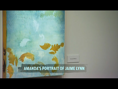
 We really liked her self-portrait. Especially the idea of using her own birth certificate and cropping/highlighting the words "she is person." It had a strangely personal feel to it despite the cold institutional quality of the source.
 We tend to think her mistake was trying to apply the same sort of thinking to a portrait of someone she didn't know. You can do that kind of intensely personal abstract stuff when you know your subject really well, but when you don't, the result looks like this. Like wallpaper or high-end giftwrap. Definitely the right choice to go home.
Erik:
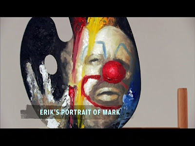
 It's all right. To be blunt (and a little cliche) it's first-year art student.
 Which looks like it may be a problem for him. This was embarrassingly amateur. Using the palette and easel was, as Judith pointed out, pure high school art class. Technically, he seems to have some skill, but the end result didn't really capture his subject at all, making him look scary and murderous, which doesn't appear to have been his intent.
He needs to stop worrying about his lack of training and trying to be charming. Like we said, he's got skills but we're not sure that he's got an artist's eye.
Nao
 Her self-portrait wasn't nearly as much fun as her obnoxious self-importance. We anticipate delightfully entertaining bitchiness and obnoxiousness going forward.
 We really liked the idea behind it, to capture Miles' frenetic personality, but the end result didn't quite work. We think it's because it doesn't really feel very...well, anything. If you're going to do such an impressionistic portrait, shouldn't it have more of a personality behind it? This has as much emotion as a subway map. It's too clean and precise. If she could have portrayed some form of intensity and movement, it would have worked better.
[Photo Credit: BravoTV.com - Screencaps: projectrungay.blogspot.com]
Post a Comment
Labels: Work of Art, Work of Art Season 1, Work of Art Season 1 Episode 1


