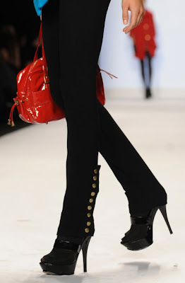
 We make no bones of the fact that we think Emilio's was the worst out of the three finalists, but it would be difficult to point to any one outfit and call it a disaster. In fact, his pieces were all uniformly very, very good. What tripped him up in our eyes (and at least partially in the judges' eyes) was that there was simply nothing "fashion" about this collection. It was merely well-made clothes. A department store line. One should expect a little bit more not only from a Bryant Park show but from a design competition.
Let's start the show:
Right off the bat he's lost us. It's a beautiful coat, but the colors are horrifically bad. We don't mind the reds and blues in this collection but that baby poop mustard yellow was hideous. In addition, that esosa print that he was so proud of looked a bit pedestrian to our eyes. Basic. Like the dress, which feels like an afterthought to the coat.
Beautifully made and styled well. We like the little gathers at the top and bottom of the belt line, which is probably flattering on a larger woman, but does strange things to the bust. Ultimately, there's just not a lot of design here.
You can find this entire outfit at any department store in the world. It's not stylish or interesting in any way.
The coat is basic (although we do like that collar), and as we said, we hate the print, but we actually like the dress here.
We don't much love this print either, but we do like the
[Photo Credit: firstVIEW.com/David Russell/myLifetime.com - Video Credit: myLifetime.com]
Post a Comment
Labels: Emilio Sosa, Project Runway, Project Runway Season 7, Project Runway Season 7 Episode 14, Project Runway Season 7 Finale


